I had a week off last week, and I was looking forward to spending it at home, there was so much I wanted to do. Probably too much, because at the end of the week, I not only didn't feel relaxed at all, but also like I hadn't done anything at all. It was just a bit of an odd old week. But looking back, I have actually done quite a lot (see below). Maybe just not everything.
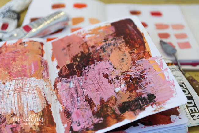
After a very long time, I finally took my acrylics out again. I started gently with adding more pages to my colour mixing book, and at the same time creating background pages with the left over paints in one of my art journals.
I also got a big old canvas out, that has been sitting around for a while because I didn't really know what to do with it. But now I finally have my own desk at work, after 2.5 month, with a very bare wall to stare at, so I thought this large canvas would be perfect. For some reason, I'm feeling drawn to painting landscapes at the moment, so I just slapped some paint on, thinking I might paint something from imagination. But I soon realised that wasn't really quite working. This will need a bit more work, a bit of looking through references and my photographs to find the right image that I would like to escape to from time to time at work. So there's not much yet to see on that canvas, but just picking up brushes and covering it with paint felt good.

I even spent a nice morning in the Kunsthaus (art museum) in Zürich, especially looking for landscape paintings, and it was a wonderful and inspiring experience, and after a week of feeling rather restless, finally calmed me down a bit. The best bit was not only to find inspiration, such as colour, subject matter, composition, style etc. The works of the Swiss artist Ferdinand Hodler, Giovanni Segantini and Albert Anker reminded me that I don't need to look further away for inspiration, as I tend to, but that I live in a country that has rich traditions and stunning landscapes - and they are not that far from my doorstep.
I was not only experimenting a bit on my canvas, but also in the kitchen. One thing I really wanted to make this week was bake a bread. A spelt bread. And then, I decided to not just go and make an ordinary spelt bread, but to attempt a sourdough spelt bread. Somehow, I always thought that sourdough was this mysteriously complicated affair that really only a professional baker could ever manage to make. Turns out that it is actually quite simple. All you need is basically water and flour. And patience. Because it takes at least five days until your starter, or mother, is ready and you can start baking. I found a very quick and simple recipe for baking my bread, and it came out disappointingly flat. I guess it was just a bit too quick and simple. Good things need a bit more time. But although it didn't look very pretty, it was actually very tasty. Even my Mum was very impressed and more than happy to take some of it home. And that means a lot! I've since looked up some more recipes and ordered a book as well. And I bought a banneton, which I've never even heard of until a few days ago. The mother has gone into the fridge for the moment, until the Christmas break, when I will have more time to try and attempt another bread. She might be asleep at the moment, but she's certainly smelling deliciously sour.

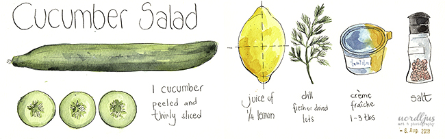
I also pickled some cucumbers and made Sauerkraut, both the traditional from white cabbage, and another one with red cabbage. The cucumbers are already ready to eat, but the Sauerkraut will need some more patience and another few weeks.

I'm looking forward to when I'll have some homemade spelt sourdough bread with homemade Sauerkraut!